

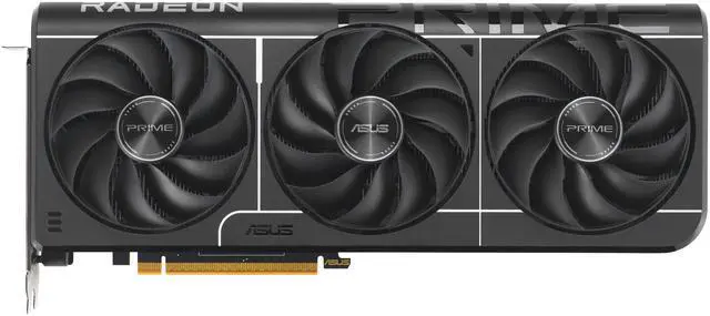
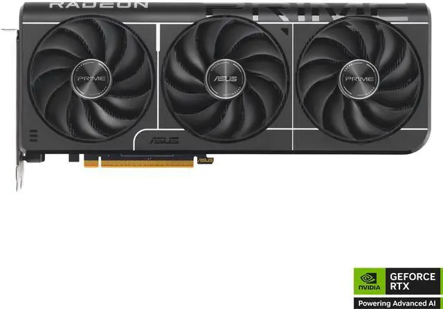
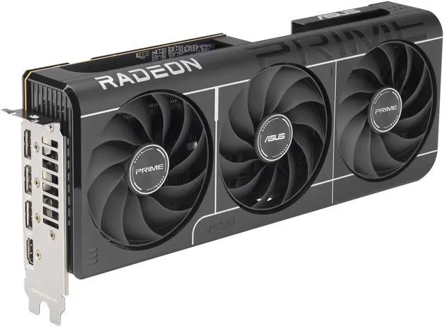
ASUS PRIME Radeon RX 9070 GRE Graphics Card PRIME-RX9070GRE-O12G-EVO
@import url(//c1.neweggimages.com/WebResource/Themes/WWW/CSS/seller/a_plus_content.css)
@import url(//c1.neweggimages.com/WebResource/Themes/WWW/CSS/seller/a_plus_content_responsive.css)
/* Picture as Background */
#overview-content .a-plus-content { font:14px Arial; line-height: 1.4em; }
#overview-content .a-plus-content .bg1 { background:url(“//c1.neweggimages.com/MPS/SellerPortal/AplusContent/f2f14dabf715ec6d598c558381e01bb2ebb17395350ee4e9042284b174f746bc.jpg”) no-repeat center center; background-size:cover; color:white; padding:4em 0; }
#overview-content .a-plus-content .bg2 { background:url(“//c1.neweggimages.com/MPS/SellerPortal/AplusContent/12db4e76b31f66dc99757d98e02da02527913ce6f1f94d4e4b330a843c69b44f.jpg”) no-repeat center center; background-size:cover; color:white; padding:4em 0; }
#overview-content .a-plus-content .bg3 { background:url(“//c1.neweggimages.com/MPS/SellerPortal/AplusContent/744295c27ac58d83192e72ca01b2b410768596c1927c03d40d0eae046440e469.png”) no-repeat center center; background-size:cover; color:white; padding:4em 0; }
#overview-content .a-plus-content .bg4 { background:url(“//c1.neweggimages.com/MPS/SellerPortal/AplusContent/774ecb9ff4c1538c6e65e2b07300985919fa5055f3d370d17abb93580de2be09.jpg”) no-repeat center right; background-size:cover; color:white; }
#overview-content .a-plus-content .bg1a { background:url(“32K-002F-00058/banner.png”) no-repeat center center; background-size:cover; color:white; padding:4em 0; }
#overview-content .a-plus-content .bg2a { background:url(“32K-002F-00058/banner.png”) repeat-y center center; background-size:cover; }
#overview-content .a-plus-content .bg3a { background:url(“32K-002F-00058/banner.png”) no-repeat fixed center; color:white; padding:3em 2em; }
/* verical alignment */
#overview-content .a-plus-content .vertical-align-center { display: inline-flex; flex-direction: column; justify-content: center; }
#overview-content .a-plus-content .vertical-align-bottom { display: inline-flex; flex-direction: column; justify-content: flex-end; }
/* 1st titles */
#overview-content .a-plus-content .a-plus-title.text1 { font-size:1.6em; font-weight:100; line-height: 1.2em; }
#overview-content .a-plus-content .a-plus-title.text2 { font-size:3.6em; font-weight:bold; line-height: 1.2em; text-transform:uppercase; }
#overview-content .a-plus-content .a-plus-title.text3 { font-size:2.6em; font-weight:bold; line-height: 1.2em; }
#overview-content .a-plus-content .a-plus-title.text4 { font-size:1.8em; font-weight:100; line-height: 1.2em; }
#overview-content .a-plus-content .a-plus-title.text5 { font-size:1.7em; font-weight:bold; line-height: 1.2em; }
#overview-content .a-plus-content .a-plus-title.text6 { font-size:1.6em; font-weight:bold; line-height: 1.2em;text-transform:uppercase; }
#overview-content .a-plus-content .a-plus-title.text7 { font-size:1.4em; font-weight:bold; line-height: 1.2em; }
#overview-content .a-plus-content .a-plus-title.text8 { font-size:1.2em; font-weight:bold; line-height: 1.1em; text-shadow:-1px -1px 0 #fff, 1px -1px 0 #fff, -1px 1px 0 #fff, 1px 1px 0 #fff; }
#overview-content .a-plus-content .a-plus-title.text15 { font-size:1.2em; font-weight:bold; line-height: 1.1em; margin-bottom: 1em; padding-bottom: 0.6em; margin-left: -0.5em; padding-left: 0.5em; background-image: linear-gradient(to right, #ff98ea 0% , #c572ff 20%, #655cfc 40%, #00ffff 60%, #f0ffc4 80%, #ff98ea 100%); text-shadow: 0 0 10px #c1c1c1, 0 0 3px #000, 0 0 4px #000, 0 0 5px #000, 0 0 6px #000; }
#overview-content .a-plus-content .a-plus-title.text16 { font-size:1.2em; font-weight:bold; line-height: 1.1em; background: linear-gradient(to right, #e1a93a, #ffe1ab, #ce9d45, #ffe1ab, #e1a93a); color: #f2c673; -webkit-background-clip: text; -webkit-text-fill-color: transparent; text-shadow: 0 0 0 rgb(255 255 255 / 10%); }
#overview-content .a-plus-content .a-plus-title.text7a { font-size:1.2em; font-weight:bold; line-height: 1.1em; text-shadow: 2px 3px 5px #121212; text-transform:uppercase; }
/* font */
#overview-content .a-plus-content .font1 { font-size:3em; font-weight:bold;display:inline-block; line-height:1.2em; text-transform:uppercase;}
#overview-content .a-plus-content .font2 { font-size:3em; font-weight:bold; display:inline-block; line-height:1.2em; }
#overview-content .a-plus-content .font3 { font-size:1.8em; font-weight:100; display:inline-block; line-height:1.2em; }
#overview-content .a-plus-content .font4 { font-size:1em; font-weight:bold; display:inline-block; line-height:1.2em; }
#overview-content .a-plus-content .filter1 { filter: brightness(0) invert(1); }
#overview-content .a-plus-content .has_note { font-size:1.3em; font-weight:bold; }
/* Make Circle */
#overview-content .a-plus-content .font5a { height:1.3em; width:1.3em; border-radius: 50%; border:1px solid gray; text-align:center; display:inline-block; line-height:1.2em; }
#overview-content .a-plus-content .font6a { height:1.1em; width:1.1em; border-radius: 50%; text-align:center; background-color:white; color:black; padding:0.2em; margin-right:0.4em; display:inline-block; line-height:1.2em; }
/* space */
#overview-content .a-plus-content .space1 { margin-top:1em; }
#overview-content .a-plus-content .space2 { margin-top:2em; }
#overview-content .a-plus-content .space3 { margin-top:3em; }
#overview-content .a-plus-content .space0 { margin-top:0; }
#overview-content .a-plus-content .space0b { margin-bottom:0; }
#overview-content .a-plus-content .space1b { margin-bottom:1em; }
#overview-content .a-plus-content .space2b { margin-bottom:2em; }
#overview-content .a-plus-content .space3b { margin-bottom:3em; }
#overview-content .a-plus-content .padding1 { padding-top:1em; }
#overview-content .a-plus-content .padding2 { padding-top:2em; }
#overview-content .a-plus-content .padding3 { padding-top:3em; }
#overview-content .a-plus-content .padding1b { padding-bottom:1em; }
#overview-content .a-plus-content .padding2b { padding-bottom:2em; }
#overview-content .a-plus-content .padding3b { padding-bottom:3em; }
/* background color */
#overview-content .bgcolor1 { background-color:#181818; color:white; }
#overview-content .bgcolor2 { background-color:black; color:white; padding:0 0 4em 0; }
#overview-content .bgcolor3 { background-color:#021d32; color:white; padding:1em 2em;}
#overview-content .bgcolor4 { background-color:black; color:white; padding:1em 2em;}
#overview-content .bgcolor5 { background-color:#0a0f85; color:white; }
#overview-content .bgcolor5 .a-plus-info {padding:1em 2em;}
#overview-content .bgcolor6 { background-image: linear-gradient(180deg, #151515, #062538); color:white; padding:4em 0; }
#overview-content .bgcolor7 { background-color:black; color:white; padding:4em 0;}
#overview-content .bgcolor8 { background-color:#111; color:white; padding:4em 0;}
#overview-content .bgcolor9 { background-color:black; color:white; padding:4em 0; }
#overview-content .bgcolor10 { background-color:white; color:black; padding:4em 0; }
#overview-content .swiper-with-tabs .swiper-main .swiper-slide .slide-content.widthv1 {width: calc(100% – 1px);}
/* ============================================================
Hero / banner section: text-left, product visual via bg-right
============================================================ */
#overview-content .a-plus-module.hero-section { position:relative; width:100%; min-height:670px; display:flex; align-items:center; padding:3em 0; box-sizing:border-box; overflow:hidden; margin:0; }
#overview-content .a-plus-module.hero-section .a-plus-info { position:relative; z-index:2; width:40%; padding:0 4%; box-sizing:border-box; margin:0; }
#overview-content .a-plus-module.hero-section .a-plus-img.hero-img-mobile { width:100%; }
/* font color */
#overview-content .color1 { background-image: linear-gradient(90deg, #999, #fff, #eee, #999, #fff, #eee); background-clip: text; color: rgba(255,255,255,0); }
#overview-content .color2 { color:#0db8da; font-size:1em; }
#overview-content .color3 { background: linear-gradient(to right, #00A0E9, #E4007F); background-clip: text; color: rgba(255,255,255,0); }
#overview-content .color4 { background: linear-gradient(90deg, #6AC6FF 19%, #BF00A5 96%); color: rgba(0,0,0,0); background-clip: text; }
#overview-content .color5 { color:white; text-shadow: 0 0 10px #c1c1c1, 0 0 3px #000, 0 0 4px #000, 0 0 5px #000, 0 0 6px #000; }
#overview-content .color6 { background-image: linear-gradient(180deg, #e10600, #e10600); -webkit-text-fill-color: transparent; -webkit-text-stroke-width: 1px; -webkit-text-stroke-color: white; text-shadow: 0 0 10px #e10600; letter-spacing: 0.02em; background-clip: text; color: rgba(0,0,0,0); font-size:1em; }
#overview-content .color7 { font-size:1em; font-weight:bold; padding:0.2em; background: linear-gradient(to right, #07c5ff, #4419fe, #f102e1, #ff0054, #e0ff00, #47ff00); background-clip: text; color: rgba(0,0,0,0); border: 2px solid transparent; border-image:linear-gradient(to right, #07c5ff, #4419fe, #f102e1, #ff0054, #e0ff00, #47ff00); border-image-slice: 1; font-style:italic; }
#overview-content .color8 { color:#f16522; font-size:1em; text-shadow: 0 0 10px #e10600; letter-spacing: 0.02em; }
#overview-content .a-plus-img img { display: block; margin: auto; max-width: 100%; }
#overview-content .color9 { color: rgba(255,255,255,0); }
#overview-content .color10 { color: rgba(0,0,0,0); }
/* Different border */
#overview-content .border1 { border:1px solid #0db8da; border-radius:15px; }
#overview-content .border2 { border:1px solid #a7badd; border-radius:15px; padding:2em; }
#overview-content .border3 { border: 1px solid #a7badd; border-top: 10px solid #a7badd; padding:2em; }
#overview-content .border4 { position: relative; border-right: 0; border-right:1px solid gray; }
#overview-content .border4::after { content: ”; position: absolute; top: 12%; bottom: 12%; right: -3.125%; width: 1px; background-color: #b8b8b8; }
/* picture as it is */
#overview-content .version1 { margin: 0 auto; padding: 0; text-align:center; }
#overview-content .version2 { margin: 0; padding: 0; text-align:left; }
#overview-content .version3 { margin: 0; padding: 0; text-align:right; }
#overview-content .version1 img, #overview-content .version2 img, #overview-content .version3 img { max-width:100%; }
/* text box alignment */
#overview-content .a-plus-info.center { text-align:center; }
#overview-content .a-plus-info+.a-plus-img { padding-top:1em; }
#overview-content .a-plus-img+.a-plus-info { padding-top:1em; }
#overview-content .note_detail { font-size:0.8em; font-style:italic; }
#overview-content .dividervc { width:100%; height:0; border-top:0.1em solid #d4d4d4; margin:0.6em auto; }
#overview-content .text-align-left { text-align:left; }
#overview-content .text-align-center { text-align:center; }
#overview-content .text-align-right { text-align:right; }
/* table styles */
#overview-content table.table1 { width: 100%; border-collapse: collapse; }
#overview-content table.table1 tr.row1:nth-of-type(even) { background: #fbfbfb; }
#overview-content table.table1 td.column1 { padding: 10px; border: 1px solid #ccc; text-align: center; }
#overview-content ul li::marker { color: red; }
#overview-content ul { list-style-type: square; }
#overview-content .shorts-wrapper { position: relative; width: 100%; max-width: 400px; aspect-ratio: 9 / 16; }
#overview-content .shorts-wrapper iframe { position: absolute; inset: 0; width: 100%; height: 100%; border: 0; }
#overview-content .width1a { width:95%; margin:0 auto 0; }
#overview-content .swiper-with-tabs .swiper-main .swiper-slide .a-plus-module.cover1 { padding: 0; }
#overview-content .swiper-with-tabs .swiper-tabs.bgline1 .tab-item:after { background: white; }
#overview-content .swiper-with-tabs .swiper-tabs .tab-item.margin1 { margin-bottom:0; }
#overview-content .swiper-with-tabs .slide-content.p1 { padding: 0; }
#overview-content .a-plus-text-overlay { padding:0; }
#overview-content .swiper-with-tabs .swiper-main .swiper-slide { align-items:start; justify-content: flex-start; }
#overview-content .aplus-faq .aplus-faq-head .aplus-faq-arrow.c1 { border-right: 2px solid white; border-bottom: 2px solid white; }
#overview-content .a-plus-module .custom-icon-cell img.img1 { min-width: unset; max-width: unset; }
#overview-content .aplus-faq .aplus-faq-item.line1 { border-bottom:1px solid black; }
#overview-content .features-grid { display: grid; gap: 20px; }
#overview-content .feature-card { display: flex; align-items: flex-start; gap: 20px; padding: 30px; border-radius: 12px; transition: all 0.3s ease; }
#overview-content .feature-card:hover { background: rgba(255, 255, 255, 0.06); transform: translateY(-2px); }
#overview-content .icon-wrapper { flex-shrink: 0; width: clamp(50px, 15vw, 120px); height: clamp(50px, 15vw, 120px); display: flex; align-items: center; justify-content: center; }
#overview-content .icon-wrapper svg { width: 100%; height: 100%; }
#overview-content .icon-wrapper img { width: 100%; height: 100%; object-fit: contain; }
#overview-content .feature-content { flex: 1; min-width: 0; }
#overview-content .icon-wrapper.large { width: clamp(80px, 20vw, 200px); height: clamp(80px, 20vw, 200px); }
#overview-content .icon-wrapper.extra-large { width: clamp(100px, 25vw, 300px); height: clamp(100px, 25vw, 300px); }
#overview-content .swiper-with-tabs,
#overview-content .swiper-with-tabs .swiper-container,
#overview-content .swiper-with-tabs .swiper-main,
#overview-content .swiper-with-tabs .swiper-wrapper,
#overview-content .swiper-with-tabs .swiper-slide,
#overview-content .swiper-with-tabs .slide-content { margin: 0 !important; padding: 0 !important; background: transparent !important; }
/* 2 columns centered to match 3-column width */
#overview-content .a-plus-group.columns.two-col { display: flex !important; flex-direction: row !important; justify-content: center !important; flex-wrap: nowrap !important; }
#overview-content .a-plus-group.columns.two-col > .a-plus-cell { flex: 0 0 31.33% !important; width: 31.33% !important; max-width: 31.33% !important; min-width: 0 !important; margin-left: 1% !important; margin-right: 1% !important; padding: 0 !important; box-sizing: border-box !important; }
/* ============================================================
FIX: Swiper slides with different heights (revised)
============================================================ */
/* Cap the vertical Shorts iframe so it doesn’t dominate the slide */
#overview-content .shorts-wrapper { max-width: 280px; max-height: 500px; margin: 0 auto; aspect-ratio: 9 / 16; }
/* Let the swiper-main container animate to the active slide’s height.
overflow:hidden hides any non-active slides that might briefly
stick out during the transition. */
#overview-content .swiper-with-tabs .swiper-main {
transition: height 0.35s ease;
overflow: hidden;
}
/* CRITICAL: Force every slide to TOP-align and size to its own content.
Without this, flex stretches every slide to the tallest one, then
centers its content vertically — that’s where your “awkward space”
comes from on the shorter “Expandability” tab. */
#overview-content .swiper-with-tabs .swiper-main .swiper-slide {
align-self: flex-start !important;
height: auto !important;
display: block !important; /* override any flex stretch */
}
/* The wrapper must align items to the top, not stretch them */
#overview-content .swiper-with-tabs .swiper-main .swiper-wrapper {
align-items: flex-start !important;
}
/* Slide-content should fill width but not force height, and stop
centering its inner module vertically. */
#overview-content .swiper-with-tabs .swiper-main .swiper-slide .slide-content {
width: 100%;
height: auto;
display: block !important;
}
/* The inner flex-responsive module inside each slide is the real culprit
on the Expandability tab — it has vertical-align-center children that
try to fill the slide height. Force it to its natural height. */
#overview-content .swiper-with-tabs .swiper-main .swiper-slide .a-plus-module.flex-responsive {
align-items: flex-start !important;
}
/* Vertical-align-center inside swiper slides keeps the in-text spacing
it was designed for, but should NOT stretch to fill the slide. */
#overview-content .swiper-with-tabs .swiper-main .swiper-slide .vertical-align-center {
justify-content: flex-start !important;
}
@media (min-width: 768px) and (max-width: 1024px) {
/* Tablet only: Add semi-transparent background to hero text for better readability */
#overview-content .a-plus-module.hero-section .a-plus-info { background: rgba(0, 0, 0, 0.5); padding: 2em !important; border-radius: 8px; }
/* THE FIX — force 2×2 grid on tablet */
#overview-content .a-plus-group.four-columns { display: flex !important; flex-wrap: wrap !important; flex-direction: row !important; }
}
/* Tell the browser this element is a container we can query */
#overview-content .a-plus-content { container-type: inline-size; container-name: aplus; }
/* Container query: when the A+ container itself is 480px–900px wide,
force 4-columns into a 2×2 grid */
@container aplus (min-width: 480px) and (max-width: 900px) {
#overview-content .a-plus-group.four-columns { display: flex !important; flex-wrap: wrap !important; flex-direction: row !important; }
}
/* ============================================================
1. CONTAINER QUERY SETUP (the real fix)
============================================================ */
#overview-content .a-plus-content { container-type: inline-size; container-name: aplus; }
/* ============================================================
2. CONTAINER QUERIES — these respond to A+ container width,
not viewport width, so they work no matter where A+ is embedded
============================================================ */
/* When the A+ container is 480–900px ? 2×2 grid for four-columns */
@container aplus (min-width: 480px) and (max-width: 900px) {
#overview-content .a-plus-group.four-columns { display: flex !important; flex-wrap: wrap !important; flex-direction: row !important; }
#overview-content .a-plus-group.four-columns .a-plus-cell { flex: 0 0 46% !important; width: 46% !important; max-width: 46% !important; margin: 0 2% 2em !important; box-sizing: border-box !important; }
}
/* When the A+ container is below 480px ? stack to 1 column */
@container aplus (max-width: 479px) {
#overview-content .a-plus-group.columns, #overview-content .a-plus-group.three-columns, #overview-content .a-plus-group.four-columns, #overview-content .a-plus-group.five-columns { display: flex !important; flex-direction: column !important; align-items: center !important; }
#overview-content .a-plus-group.columns .a-plus-cell, #overview-content .a-plus-group.three-columns .a-plus-cell, #overview-content .a-plus-group.four-columns .a-plus-cell, #overview-content .a-plus-group.five-columns .a-plus-cell { flex: 0 0 auto !important; width: 90% !important; max-width: 90% !important; margin: 0 auto 2em !important; padding: 0 !important; box-sizing: border-box !important; }
}
@media (min-width: 768px) {
#overview-content .width1 { width:95%; margin:0 auto 0; }
#overview-content .width2 { width:90%; margin:0 auto 0; }
#overview-content .width3 { width:65%; margin:0 auto 0; }
#overview-content .image2 { display:none; }
#overview-content .pd-left { padding-left:3em; }
#overview-content .pd-right { padding-right:3em; }
#overview-content .container-position { position: relative; padding: 0; overflow: hidden; }
#overview-content .position1 { position:absolute; margin:0; left:0; top:2%; width:100%; color:white; }
#overview-content .marginl1 { margin-left:3%; }
#overview-content .feature-icons { display: flex; justify-content: flex-start; gap: 2em; padding: 1.5em 0 0.5em; }
#overview-content .feature-icons .feature-cell { flex: 1; text-align: left; }
#overview-content .feature-icons .feature-cell img { max-height: 40px; margin-bottom: 0.5em; }
#overview-content .feature-icons .feature-cell p { margin: 0; font-size:1.1em; font-weight:100; line-height: 1.3em; }
#overview-content .features-grid { grid-template-columns: repeat(auto-fit, minmax(250px, 1fr)); }
#overview-content .a-plus-module.hero-section { min-height:634px; }
#overview-content .a-plus-module.hero-section .a-plus-info { width:46%; }
#overview-content .a-plus-module.hero-section .a-plus-img.hero-img-mobile { display:none; }
#overview-content .a-plus-module.hero-section.info-right { justify-content: flex-end; }
}
@media (min-width: 1200px) {
.features-grid { gap: 25px; }
#overview-content .features-grid.wide-columns { grid-template-columns: repeat(auto-fit, minmax(350px, 1fr)); }
}
@media (min-width: 1300px) {
#overview-content .features-grid { gap: 30px; }
}
@media (max-width: 767px) {
#overview-content .a-plus-info {padding:0 1em;}
#overview-content .a-plus-module.hero-section .a-plus-img.hero-img-mobile img {padding-bottom:0;}
#overview-content .a-plus-content .space3 { margin-top:0; }
#overview-content .pd-left img { padding-left:0; }
#overview-content .pd-right img { padding-right:0; }
#overview-content .marginl1 { margin-left:0; }
#overview-content .image1 { display:none; }
#overview-content .a-plus-module.mix.flex-responsive { flex-direction: row !important; align-items: center !important; }
#overview-content .a-plus-module.mix.flex-responsive > .flex-auto:first-child { width: 50px !important; min-width: 50px !important; flex: 0 0 auto !important; margin-right: 10px !important; margin-bottom: 0 !important; }
#overview-content .a-plus-module.mix.flex-responsive > .flex-auto:nth-child(2) { width: auto !important; flex: 1 1 auto !important; margin-right: 0 !important; margin-bottom: 0 !important; }
#overview-content .a-plus-module.flex-responsive { flex-direction: column; align-items: center; }
#overview-content .a-plus-text-overlay { position: static !important; width: 100% !important; }
#overview-content .a-plus-module.flex-responsive .a-plus-img.flex-none { width: 90% !important; margin: 0 auto 1em; box-sizing: border-box; }
#overview-content .a-plus-module.flex-responsive .a-plus-info.flex-auto { flex: 0 0 auto !important; width: 90% !important; max-width: 90%; margin-left: auto; margin-right: auto !important; padding: 0.5em 0; box-sizing: border-box; margin-bottom:2em; }
#overview-content .a-plus-group.columns, #overview-content .a-plus-group.three-columns, #overview-content .a-plus-group.four-columns, #overview-content .a-plus-group.five-columns { flex-direction: column; align-items: center; }
#overview-content .a-plus-group.columns .a-plus-cell, #overview-content .a-plus-group.three-columns .a-plus-cell, #overview-content .a-plus-group.four-columns .a-plus-cell, #overview-content .a-plus-group.five-columns .a-plus-cell { flex: 0 0 auto; width: 90%; margin: 0 auto 2em!important; padding:0; box-sizing: border-box; }
#overview-content .a-plus-group.columns .a-plus-cell.no-space { padding:0; }
#overview-content .a-plus-cell.version1z { width: 100%; }
#overview-content .border4::after { display: none; }
#overview-content .a-plus-img img { max-width: 100%; }
#overview-content table.table1 { padding:0 1em 0 0; }
#overview-content table.table1, #overview-content table.table1 thead.head1, #overview-content table.table1 tbody, #overview-content table.table1 th.head1, #overview-content table.table1 td.column1, #overview-content tr.row1 { display: block; }
#overview-content .table1 td.column1 { padding-left:60%; border: 2px #6a5e60 solid; text-align: left; }
#overview-content tr.row1:first-child { position: absolute; top: -9999px; left: -9999px; }
#overview-content tr.row1 { border: 1px solid #ccc; }
#overview-content td.column1 { border: none; border-bottom: 1px solid #eee; position: relative; padding-left: 60%; }
#overview-content td.column1:before { position: absolute; top: 6px; left: 6px; width: 55%; padding-right: 10px; white-space: wrap; text-align:left; overflow-wrap: break-word; word-break: break-word; line-height:1.4em; }
#overview-content table.table1 td.column1 { padding: 10px; border: 1px solid #ccc; text-align: right; padding-left: 65%; }
#overview-content td.column1:nth-of-type(1):before { content: “First Name”; }
#overview-content td.column1:nth-of-type(2):before { content: “Last Name”; }
#overview-content td.column1:nth-of-type(3):before { content: “Job Title”; }
#overview-content td.column1:nth-of-type(4):before { content: “HS100”; }
#overview-content td.column1:nth-of-type(5):before { content: “HS105”; }
#overview-content td.column1:nth-of-type(6):before { content: “HS100 KIT”; }
#overview-content td.column1:nth-of-type(7):before { content: “HS105 KIT”; }
#overview-content td.column1:nth-of-type(8):before { content: “HS110 KIT”; }
#overview-content td.column1:nth-of-type(9):before { content: “RE270K”; }
#overview-content td.column1:nth-of-type(10):before { content: “RE370K”; }
#overview-content .feature-icons { flex-direction: column; gap: 1em; }
#overview-content .feature-icons .feature-cell { text-align: center; padding-bottom:2em; }
#overview-content .features-grid { grid-template-columns: 1fr; }
#overview-content .feature-card { padding: 20px; gap: 15px; }
#overview-content .icon-wrapper { width: 60px; height: 60px; }
#overview-content .icon-wrapper.large { width: 90px; height: 90px; }
#overview-content .icon-wrapper.extra-large { width: 120px; height: 120px; }
#overview-content .feature-title { font-size: 18px; }
#overview-content .feature-description { font-size: 14px; }
/* Force three-column spec layout to stack vertically */
#overview-content .a-plus-module.mix.flex-responsive.img-is-large { flex-direction: column !important; align-items: stretch !important; }
#overview-content .a-plus-module.mix.flex-responsive.img-is-large > .flex-auto { width: 90% !important; margin: 0 auto!important; margin-bottom: 2em !important; }
#overview-content .a-plus-module.hero-section { flex-direction:column; min-height:0; padding:0; background:none !important; }
#overview-content .a-plus-module.hero-section .a-plus-info { width:100%; padding:1.5em 1em; background:#000; box-sizing:border-box; }
#overview-content .a-plus-module.hero-section .a-plus-img.hero-img-mobile { display:block !important; width:100%; }
#overview-content .a-plus-module.hero-section .a-plus-img.hero-img-mobile img { width:100%; height:auto; display:block; padding-bottom:3em; }
#overview-content .a-plus-module.hero-section .a-plus-info + .a-plus-img.hero-img-mobile { padding-top: 0; }
#overview-content .a-plus-module.hero-section.spacev { padding-top:3em; }
#overview-content .a-plus-group.columns, #overview-content .a-plus-group.three-columns, #overview-content .a-plus-group.four-columns, #overview-content .a-plus-group.five-columns { flex-direction: column !important; align-items: center !important; }
#overview-content .a-plus-group.columns .a-plus-cell, #overview-content .a-plus-group.three-columns .a-plus-cell, #overview-content .a-plus-group.four-columns .a-plus-cell, #overview-content .a-plus-group.five-columns .a-plus-cell { flex: 0 0 auto !important; width: 90% !important; max-width: 90% !important; margin: 0 auto 2em !important; padding: 0 !important; box-sizing: border-box !important; }
#overview-content .shorts-wrapper { max-width: 70%; max-height: none; }
#overview-content .a-plus-group.four-columns {
display: flex !important;
flex-direction: column !important;
align-items: center !important;
}
#overview-content .a-plus-group.four-columns .a-plus-cell {
flex: 0 0 auto !important;
width: 90% !important;
max-width: 90% !important;
margin: 0 auto 2em !important;
}
}
Experience Primal performance with the Prime Radeon™ RX 9070 GRE EVO graphics card featuring a compact 2.5-slot design for expansive compatibility, enhanced by a phase-change GPU thermal pad and a triple-fan setup for supreme cooling.
2.5 Slot Design
Compatible with small-form-factor builds
Axial-Tech Fans
Longer blades improve airflow and dispersion
Phase-Change GPU Thermal Pad
Optimal heat dissipation for GPU longevity
Dual-Ball Fan Bearings
Up to twice the lifespan of sleeve bearings
GPU Tweak III
Ultimate GPU tuning utility
Dual BIOS
Toggle between Performance or Quiet modes
Adobe Creative Cloud
One Month of Free Adobe Creative Cloud
Perfect PSU Companion
ASUS Prime 850W/750W Gold
The Prime Radeon™ RX 9070 GRE EVO features a 2.5 slot design with a carefully arranged layout for the shroud, heatsink and heat pipes to let the three Axial-tech fans leverage chassis side-panel ventilation and deliver optimal thermal performance.
Three tried-and-true Axial-tech fans feature a smaller hub that facilitates longer blades and a barrier ring to increase downward air pressure for lower temperatures, less noise and higher performance.
All three fans come to a standstill when GPU temperatures are below 55°C, letting you play less demanding games or perform light tasks in relative silence. Fans start up again when temperatures are over 60 C, establishing a speed curve that balances performance and acoustics for work or play.
Picture is for illustration only.
Different bearing types have unique pros and cons. Dual-ball bearings excel at durability and can last up to twice as long as sleeve bearing designs.
Large backplate vents significantly enhance heat dissipation, helping to keep the GPU cooler during intense tasks. This additional airflow helps ensure optimal temperatures, boosting performance, longevity and stability by defending against overheating and thermal throttling.
By melting to effectively fill the gaps between the GPU and the thermal module, a premium phase-change GPU thermal pad provides superior thermal conductivity and enhanced heat dissipation, ensuring optimal performance and longevity for graphics cards under heavy loads.
ASUS GPU Guard applies adhesive to secure all four corners to reduce the risk of cracks, while a GPU bracket helps ensure uniform mounting pressure and extra stability.
The PCB is reinforced by a backplate that adds structural rigidity, helping to prevent flex and to protect components and trace pathways from damage.
The mounting bracket features grade 304 stainless steel, chosen for its strength and high resistance to corrosion.
Do you prioritize low core temps or low noise levels? Performance mode lets the fans spin up to keep the card running cool all the time, and Quiet mode keeps the same power target and top-end settings while offering a less aggressive fan curve for quieter operation at moderate temperatures.
An automated manufacturing process that sets new standards in the industry by allowing all soldering to be completed in a single pass, ASUS Auto-Extreme technology reduces thermal strain on components and avoids the use of harsh cleaning chemicals, resulting in less environmental impact, lower manufacturing power consumption and a more reliable product overall.
Use the wattage calculator to estimate how much power you’ll need to fuel your rig, and then pick a compatible ROG, TUF Gaming or Prime power supply for ultimate performance.
The ASUS GPU Tweak III utility takes graphics card tuning to the next level. It lets you tweak critical parameters including GPU core clocks, memory frequency and voltage settings, with the option to monitor everything in real-time through a customizable on-screen display. Advanced fan control is also included along with many more features to help you get the most out of your graphics card.
Enjoy all things AI at Adobe. Get complimentary membership to Adobe Creative Cloud with the purchase of select ASUS products, granting you access to all Adobe apps and Substance 3D.
1. AMD FidelityFX Super Resolution (FSR) versions 1, 2, 3, and 4 are available on select games which require game developer integration and are supported on select AMD products. AMD does not provide technical or warranty support for AMD FidelityFX Super Resolution enablement on other vendors’ graphics cards. See https://www.amd.com/en/technologies/fidelityfx-super-resolution for additional information. GD-187b.
2. As of March 2023, Radeon Super Resolution (RSR) is compatible with Radeon RX 5000 series graphics and newer and works with games that support exclusive full-screen mode. AMD Software: Adrenalin Edition 22.3.1 or newer is required. For additional information, visit www.amd.com/rsr. GD-197.
3. AMD smart technologies, including AMD SmartAccess Graphics, SmartAccess Storage, SmartAccess Video, SmartShift Eco, and SmartShift Max may require OEM or developer enablement and are available with select configurations only. Select additional AMD hardware is required. For additional information see https://www.amd.com/en/graphics/amd-radeon-rx-laptops. GD-216.
4. Video codec acceleration (including at least the HEVC (H.265), H.264, VP9, and AV1 codecs) is subject to and not operable without inclusion/installation of compatible media players. GD-176
5. AMD Noise Suppression works on AMD Ryzen™ 6000 Series processors with integrated graphics, and AMD Radeon™ RX 6000 Series desktop graphics and newer. AMD Noise Suppression requires AMD Software: Adrenalin Edition™ 22.7.1 and newer and may not install on systems equipped with Realtek ACP-based ANR. GD-213
6. AMD HYPR-RX works on the AMD Radeon™ RX 7000 Series GPUs and newer or the Ryzen 7040 Series APUs with integrated RDNA 3 graphics and newer. AMD HYPR-RX allows various features within AMD Software interoperate, working at the same time, including Radeon Super Resolution, FidelityFX Super Resolution, Radeon Anti-Lag, Radeon Boost, and AMD Fluid Motion Frames where applicable to select titles. GD-225A.
7. Radeon™ Boost is compatible with Windows 10 and 11 in select titles only. Hardware compatibility includes RX 400 and newer consumer dGPUs, Ryzen 2000 and newer APUs, including hybrid and detachable graphics configurations. No mGPU support. Radeon™ Boost VRS compatible with AMD Radeon™ RX 6000 Series Graphics exclusively. For a list of compatible titles see https://www.amd.com/en/technologies/radeon-boost GD-158
8. Radeon™ Anti-Lag is compatible with DirectX 9, DirectX 11 and DirectX 12 APIs, Windows 10 and 11. Hardware compatibility includes Polaris and newer consumer dGPUs Ryzen 2000 and newer APUs, including hybrid and detachable graphics configurations. No mGPU support. GD-157
9. AMD Fluid Motion Frames, or AFMF, is a frame generation technology designed to increase frame rates and smooth movement for game winning performance with minimal impact to image quality. AFMF is integrated into AMD Software and currently supports the Radeon RX 6000 and 7000 series graphics cards. GD-234
© Pearl Abyss Corp. All Rights Reserved.
© 2024 MARVEL
© 1997-2024 NetEase,Inc. All Rights Reserved
© 2024 Activision Publishing, Inc. ACTIVISION, CALL OF DUTY, and CALL OF DUTY BLACK OPS are trademarks of Activision Publishing, Inc. All other trademarks and trade names are the property of their respective owners.
© 2025 Advanced Micro Devices, Inc. All rights reserved. AMD, the AMD Arrow logo, AMD Radiance Display, AMD Smart Access Memory, RDNA, Ryzen, Radeon, and combinations thereof are trademarks of Advanced Micro Devices, Inc. Other product names used in this publication are for identification purposes only and may be trademarks of their respective companies.
/* Newegg A+ swiper height fix — fully isolated from host page.
– No properties added to window (uses a Symbol on document instead)
– Scope is found by walking up from the script tag; falls back safely
– Auto-tears down if the A+ block is removed from the DOM
– Resize listener uses AbortController for one-call cleanup
– All state lives inside the IIFE closure */
(function () {
‘use strict’;
/* ———- 1. Locate the A+ scope without touching window ———- */
var thisScript = document.currentScript;
if (!thisScript) return; // Inlined or moved — bail rather than risk wrong scope.
var scope = thisScript.closest(‘#overview-content’);
if (!scope) return; // Not inside an A+ block — do nothing.
/* ———- 2. Guard against double-init using a Symbol on the
scope element itself, NOT window. If the host loads
this script twice (e.g. two A+ blocks), each block
is its own scope, so they don’t collide. ———- */
var INIT_FLAG = ‘__neweggSwiperFixInit_’ + Math.random().toString(36).slice(2);
// But we want one-per-scope, not one-per-script-instance, so use a fixed key:
var SCOPE_KEY = ‘__neweggSwiperFixScopeInit’;
if (scope[SCOPE_KEY]) return;
scope[SCOPE_KEY] = true;
/* ———- 3. All cleanup is tracked here ———- */
var observers = [];
var timeouts = [];
var controller = (typeof AbortController !== ‘undefined’) ? new AbortController() : null;
var signal = controller ? controller.signal : undefined;
var disconnectObserver = null; // For watching scope removal
function trackTimeout(fn, delay) {
var id = setTimeout(function () {
// Drop our reference once it fires
var idx = timeouts.indexOf(id);
if (idx !== -1) timeouts.splice(idx, 1);
try { fn(); } catch (e) { /* swallow */ }
}, delay);
timeouts.push(id);
return id;
}
/* ———- 4. Core measure-and-apply function ———- */
function adjustSwiperHeight(swiperMain) {
try {
var activeSlide = swiperMain.querySelector(‘.swiper-slide-active’)
|| swiperMain.querySelector(‘.swiper-slide’);
if (!activeSlide) return;
var innerContent = activeSlide.querySelector(‘.slide-content’);
if (!innerContent) return;
swiperMain.style.height = ‘auto’;
var rect = innerContent.getBoundingClientRect();
var contentHeight = rect.height || innerContent.scrollHeight;
if (contentHeight <= 0) return;
swiperMain.style.height = contentHeight + 'px';
var wrapper = swiperMain.querySelector('.swiper-wrapper');
if (wrapper) wrapper.style.height = contentHeight + 'px';
} catch (e) { /* never break the host page */ }
}
function debounce(fn, wait) {
var t;
return function () {
clearTimeout(t);
t = setTimeout(fn, wait);
};
}
/* ———- 5. Init: wire up each swiper-with-tabs in our scope only ———- */
function initSwiperHeightFix() {
var swiperWithTabs = scope.querySelectorAll('.swiper-with-tabs');
if (!swiperWithTabs.length) return;
swiperWithTabs.forEach(function (swiperBlock) {
var swiperMain = swiperBlock.querySelector('.swiper-main');
if (!swiperMain) return;
if (swiperMain.classList.contains('swiper-container-autoheight')) return;
adjustSwiperHeight(swiperMain);
// MutationObserver on slide class changes
var observer = new MutationObserver(function () {
trackTimeout(function () { adjustSwiperHeight(swiperMain); }, 60);
});
swiperMain.querySelectorAll('.swiper-slide').forEach(function (slide) {
observer.observe(slide, { attributes: true, attributeFilter: ['class'] });
});
observers.push(observer);
// Tab clicks — listeners use AbortController signal so one .abort()
// removes ALL of them at once, no per-element bookkeeping.
var tabs = swiperBlock.querySelectorAll('.swiper-tabs .tab-item');
tabs.forEach(function (tab) {
tab.addEventListener('click', function () {
[80, 200, 450].forEach(function (d) {
trackTimeout(function () { adjustSwiperHeight(swiperMain); }, d);
});
}, signal ? { signal: signal } : false);
});
// Image / iframe load — also under the signal
swiperMain.querySelectorAll('img, iframe').forEach(function (el) {
el.addEventListener('load', function () {
adjustSwiperHeight(swiperMain);
}, signal ? { signal: signal, once: true } : { once: true });
});
// Settle passes
[400, 1200, 2500].forEach(function (d) {
trackTimeout(function () { adjustSwiperHeight(swiperMain); }, d);
});
});
// ONE debounced resize handler on window — but registered with the
// abort signal so it's removed on teardown.
var onResize = debounce(function () {
scope.querySelectorAll('.swiper-with-tabs .swiper-main').forEach(adjustSwiperHeight);
}, 150);
window.addEventListener('resize', onResize, signal ? { signal: signal } : false);
}
/* ———- 6. Full teardown — disconnects everything in one call ———- */
function teardown() {
observers.forEach(function (o) { try { o.disconnect(); } catch (e) {} });
observers.length = 0;
timeouts.forEach(function (id) { clearTimeout(id); });
timeouts.length = 0;
if (controller) { try { controller.abort(); } catch (e) {} }
if (disconnectObserver) { try { disconnectObserver.disconnect(); } catch (e) {} }
try { scope[SCOPE_KEY] = false; } catch (e) {}
}
/* ———- 7. Auto-teardown if the A+ block is removed from the DOM
(SPA navigation, dynamic content swap, etc.) ———- */
if (scope.parentNode) {
disconnectObserver = new MutationObserver(function () {
if (!document.contains(scope)) teardown();
});
disconnectObserver.observe(scope.parentNode, { childList: true });
}
/* ———- 8. Kick off ———- */
if (document.readyState === 'complete') {
trackTimeout(initSwiperHeightFix, 400);
} else {
window.addEventListener('load', function () {
trackTimeout(initSwiperHeightFix, 400);
}, signal ? { signal: signal, once: true } : { once: true });
}
})();
User Reviews
Be the first to review “ASUS PRIME Radeon RX 9070 GRE Graphics Card PRIME-RX9070GRE-O12G-EVO”
Related Deals
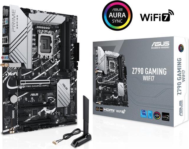
ASUS Z790 GAMING WIFI7 (LGA 1700) ATX mo…
ASUS ROG MAXIMUS Z890 HERO Intel® Z890 …
There are no reviews yet.